






















All new Registrations are manually reviewed and approved, so a short delay after registration may occur before your account becomes active.
KeyHelp: Dark Mode for the free version

Hey All,
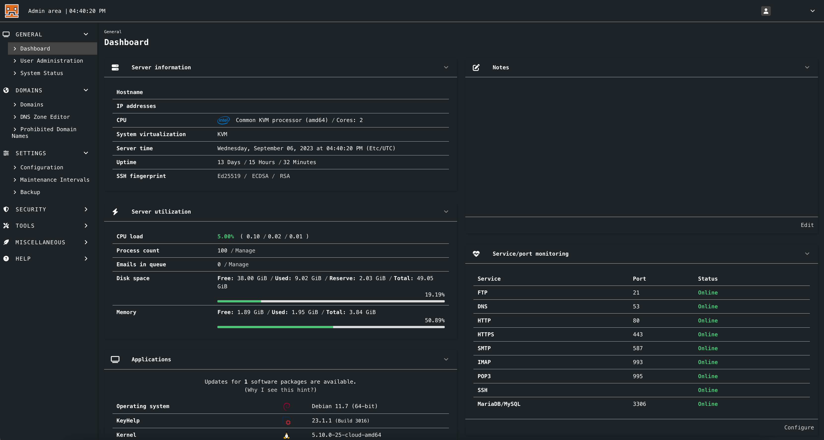
Last night I started playing with the additional CSS feature in the White label option in KeyHelp and I made a Dark Mode for Standard KeyHelp panel users. I call it the poor-man DarkMode 
Since this year the Dark Mode official feature will be deployed for PRO users only.. so here you go and for free.
Instructions 
GO TO
Settings>Configuration>White Label>(Edit)All Languages: Inside the Additional CSS box add the below CSS code...Then click SAVE and Enjoy
.title {
    color: white;
}

html {
    background-color: black;
}

#header {
    background-color: #141415;
}

#user-menu {
    background-color: #1e1c1c;
}

#header a {
    color: #e0dada;
}

.dropdown-item {
    color: #cacaca;
}

.card-header {
    background-color: #00000040;
}

.card {
    color: #fff;
}

.card-content {
    background-color: #7b7b7b21;
}

.table.is-striped tbody tr:not(.is-selected):nth-child(2n) {
    background-color: #f0efef;
}

.card-footer {
    background-color: #b6b6bc;
}

.breadcrumb li + li::before {

    color: #fffafa;
}

.breadcrumb li.is-disabled a {
    color: #fff;
}

.breadcrumb a {
    color: #6fbcff;
}
.breadcrumb a:hover {
    color: #ffb96f;
}

.card {
    color: #2b2b2b;
}

.has-text-grey-light {
    color: #8e8e8e !important;
}

.tabs a {
    color: #ffffffbf;
}

.tabs.is-boxed li.is-active a {
    background-color: #d7d7d7;
}

.tabs.is-boxed a:hover {
    background-color: #ddd;
    border-bottom-color: #0f0f0f;
}
.select select, .textarea, .input {
    background-color: #fbfbfb;
    border-color: #dbdbdb;
    color: #363636;
}
input[disabled], input[readonly], textarea[disabled], select[disabled] {
    color: #0d0d0d !important;
    border-color: #999797 !important;
    background-color: #c7c7d2 !important;
}
.has-text-grey {
    color: #555 !important;
}
.table {
    color: #000;
}
.file.is-link .file-cta {
    background-color: #285bac;
    border-color: transparent;
    color: #fff;
}
.button.is-link {
    background-color: #285bac;
    border-color: transparent;
    color: #fff;
}

.button.is-danger {
    background-color: #a62c44;
    border-color: transparent;
    color: #fff;
}

body {
    color: #cecece;
}

a {
    color: #0062ff;
}
Also you can make your OWN banner, Keep the original one or upload the SVG img I used it the screnshot, you can download it from the link below ( Extract the SVG file first from ZIP file then upload it using the Banner for internal area option - in the same White label page).
DOWNLOAD HERE
Let me know if you have any issues or have improvements... 
Show us here your screenshots once implemented... because why not 
BTW the VPS used for this tutorial and shown the in screenshot is from RackNerkd ( Specs: Atlanta - USA, 2 shared CPU, 2GB Ram and 35 SSD, Solid performance so far) @dustinc
Thanks



Comments
Nice to see keyhelp is getting some love here Keep the good work up!
@PandoGulf -- awesome tutorial - happy to see contributions like this within the community.
Thank You for working with RackNerd! We appreciate your business and are happy to hear our service is working out Solid Performance!!! Love it. 👊
KeyHelp theme dark free version: https://keyhelptheme.com
Thanks for sharing.
@Arkas necro
It's fairly useful to some of us, so quit snitching.
I recently came across keyhelp after adjusting dns records for a client and was wondering what panel they were using.
would rather open a new thread
We've got a perfectly good one here
I have too many started/opened projects and domains unfortunately cost money. So, I'm informing you guys that I've changed the website address: https://keyhelptheme.0ct0pu5.dev .Of course, the old domain is redirected to the new address. People who use the premium theme (based on cpanel - theme) will receive access to updates via email.