


New on LowEndTalk? Please Register and read our Community Rules.
All new Registrations are manually reviewed and approved, so a short delay after registration may occur before your account becomes active.
All new Registrations are manually reviewed and approved, so a short delay after registration may occur before your account becomes active.
SolusVM 2 is here!

From SolusVM’s blog post today: https://solusvm.com/welcome-to-solusvm-2/
“In short, SolusVM 2 is the next generation of time-tested VM solutions you deserve. We offer lightning-fast, on-demand VMs, a simple API, and an easy-to-use self-service control panel for customers to unleash their full potential.
For SolusVM 1 users, the good news is that the licensing model and prices remain the same. The ability to migrate to SolusVM 2 with the import tool will be available in early Q1 2023. We will definitely continue to support SolusVM 1 until most customers are ready to make the move.
For SolusIO users, you can upgrade to SolusVM 2 with the latest update on October 17th.”

Comments
nice
No one believes that")
Francisco
Your SolusVM version number has been doubled.
Only took what, 5 years and I see they gave up on Solus.io (did anyone use that??)
haha, they fogot to add with up to 30% price increase shortly as they are the same company as cPanel, L.L.C.
No.
They want everyone to move from v1->v2 thinking 'omg free upgrade, finally'. In 12~18 months or so they'll introduce new pricing.
Francisco
Are they still using PHP without proper privilege separation (i.e. the entire interface running as root), or did they improve that?
We have been running SolusIO since October 2020 on all AMD Ryzen CPUs. It's been very stable for us.
Solusvm 2 finally is here, and it seem to be better than ever
UX looks beautiful at first impression.
License price looks like remains the same at first impression..
A poll on when people think the SolusVM price hike will come
Even with SolusVM 2 now out, we are continuing to move off the platform to VMManager which has been very stable, looks good and fair pricing for a higher quality product.
Solus 2, here goes the never ending cycle of bug chasing again.
You meant UI? Cause UX is horrible, a lot of cognitive load and requires you to learn where something is, no good repetitive pattern
Is it written in Rust? If not count me out.
That's for sure. I've reported a countless amount of bugs in v1, and credit where it's due, they've fixed most pretty quickly in mainline updates.
https://virtfusion.com/
We actually just released a video on this:
I think the interface looks pretty nice on SVM 2.0.
Could have been worse for sure.
Yes, I meant UI.
I agree UI is rather good, but UX has weird choices for example icons are too big.
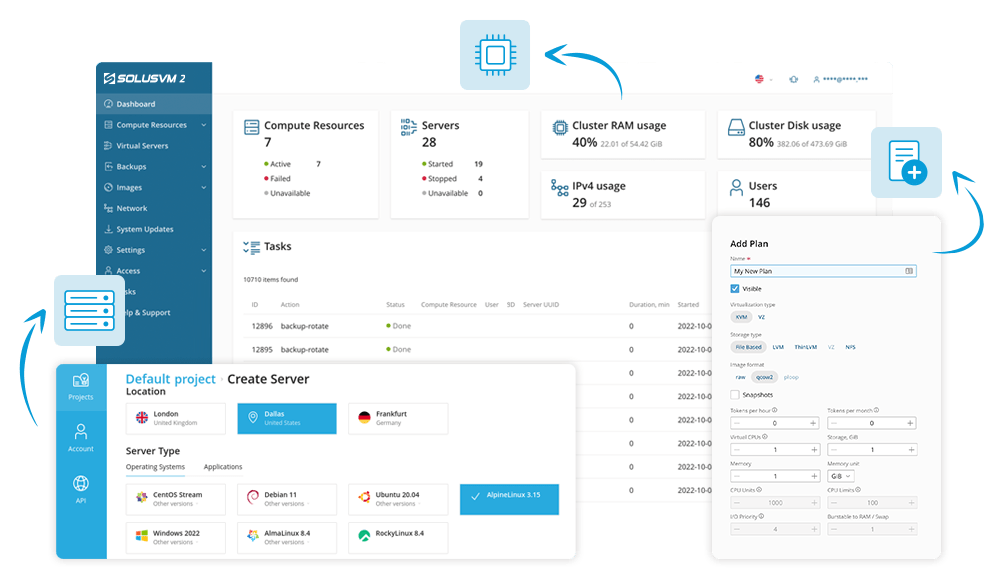
Icons are there to help find what you looking for faster (you dont need to read, you just scan screen for familiar lookin icons), but they dont serve any informative purpose apart from it so I would decrease their size or better yet, add numerical information like "40%" in near it so it will be easily scannable left-to-right.
First you look at CPU graphic, then you see number that you looking for and if you dont get what this number is then below that you would have text "CPU Usage".
This design with fixed big icons, fixed text near it and you need to look right-down from icon to get what you need, its just bad UX.
In contrast country chooser is perfect UX. First icon, then name of the city and if you doesn't know where this city is (rare problem) you have country name. This way user doesn't need to process country name if he already knows where city is - reducing required time and cognitive load.
To make it as an example
If we would like to design dashboard with same good pattern it should be
icon -> information -> explanation
so
cpu icon -> 40% -> CPU usage
But now it is
icon -> explanation -> information
You're processing uneccessary explaination every time and your eye goes right-down, very bad positioning.
Edit: and why "cluster RAM usage" has CPU icon?! xD
I've made very simple "sketch" in 10 minutes to explain what I mean

My version is still not ideal, I didn't do any research prior and I didnt ever tried to make something for server management. Still, don't you think it is better...? And I spent just 10 minutes...
By reading it from left to right you get
proper icon -> simple information -> more detailed information -> (another line) explaination.
Its the best solution, you can process information way faster. From important simple value to something that you need to read only once and because it is another line you can just ignore it later.
After clicking graph it would open modal where you could change granularity (1h, 24h, 7 days) and it would display table where you would see customer VMs sorted by RAM usage and some quick actions like "make ticket" after clicking it would paste values of it - useful if customer would break ToS like CPU usage all the time and you wouldnt have automated system for it. Such quick actions need simple research, just make simple session tracking and see where admin is heading after seeing that modal. That way we can make one button and admin gets where he wants with one click instead of 10")
May aswell close the topic - Mike got the correct answer 😉
@AXYZE sure, yours looks good.
However that info is meant for the administrator. If the administrator need fancy things and is unable to understand the left one, then he shouldn't be an administrator at all.
We don't need fancy stuff in the admin side. Effort primarily should only be end-customer front-end side.
From an administrator perspective I would prefer to login CLI and type a command and see what's up. So in the end that effort is wasted from the vendor side.
Also pretty things like that (widgets), specially since you added the chart, it kind of use more resources from the client side and certainly increase the amount of data required to load from the back-end.
I'm pretty sure that you are watching it from UI perspective where I clearly said its about UX. UI is ok already if you like this style.
So its not about looking nice, its about making sure you see what you need fast without unnecessary load on your brain.
You even want CLI... let me guess, because it will be faster to process and you can read it left-to-right?
And this is exactly what is wrong with existing design. If you want to read left-to-right you read label which is meaningless after you see panel couple times. To see value you want your eyes need to go to next line, right-down from icon.
I know this info is meant for the administrator and that's exactly why I proposed to make labels less obvious as sysadmin won't need to read them again and again.")
I made most useful info big and noticeable.
Hide things that admin will know after seeing this panel 10x times, he will just search for familiar icon and then value. Very easy & fast, just like in CLI.
If you ever get such problems with your site let me optimise it for you.
Its 10 numerical values. Literally 80 bytes without any compression. Font itself weights 2500 times more.
This can be even inlined into server-side generated HTML without doing extra request. This resource is like an line of text, good graph can be written without any JS.
Edit: I know many people underestimate importance of such simple things in UX, but believe me. I did some UX optimizations that reduced time required to do simple things in internal tools by MORE than half. We are talking about people that used tool for years and still, after changes they got used to it within a day and I saw how fast they do the same work. Your brain is used to some designs by evolution and by your whole life - for example westerners always read left-to-right, because of that sidebars are always on left for example. Arabic sites have sidebar on right, because they write right-to-left.
My graph gives you visual idea about trends in RAM usage. You can instantly see if there was RAM spike and roughly where it was (as its 24hours). This simple, very important thing can make you instantly notice a problem or have a peace in mind without extra clicks. Its a freakin dashboard, most important info in one place, at a glance...
You would never want to touch CLI if website would be designed nicely. Just like you don't use CLI to open your games etc.
Agree to disagree I guess. This is an admin tool. Most providers use solus to provide the end-user a way to manage their VM.
They also use it because of the API to WHMCS integration, that will auto deploy the VM.
For managing,,,, people with experience would be fine to go into cli and do some stats. Probably automate some monitoring alerts, and export that into an external tool.
Basically two different type of people. Requires different tools.
@AXYZE
From my developer side in my opinion, the more shit you put to load from the back-end the more wasted resources. Like for example you would need data for the chart embedded. The experience the admin is getting as a result, more info by casually looking. But was it worth? Probably the admin never login to that since he/she relies on external monitoring.
But in this case the data is already there, it is just displayed in a better way. If you are going to spend the resources to gather the data anyway, then why not make good use of it?
I totally agree with @AXYZE here. It is a small, subtle change but it does make a difference. I'm usually a hardcore cli guy myself, but after decades in the industry I have learned how much difference a good UX actually makes. It does optimize efficiency, it minimizes mistakes and generally just makes people happier.
A good UX is usually the reason people go "I just prefer that one, I dont know why" when asked why they chose a certain product.