
























All new Registrations are manually reviewed and approved, so a short delay after registration may occur before your account becomes active.
I got tired of the LET layout, so I built BetterLET (free Chrome extension)
 MakersHelpDesk
Member
I've been a lurker for a long time, so I'm here alot but I've always been enraged with the UI. Thats just because I'm kind of an adhd nerd for UI (I love doing design, and it should have been what I did for a career) anyway - I built a free Chrome extension that reskins it. It's called BetterLET.
You load it as an unpacked chrome extension.
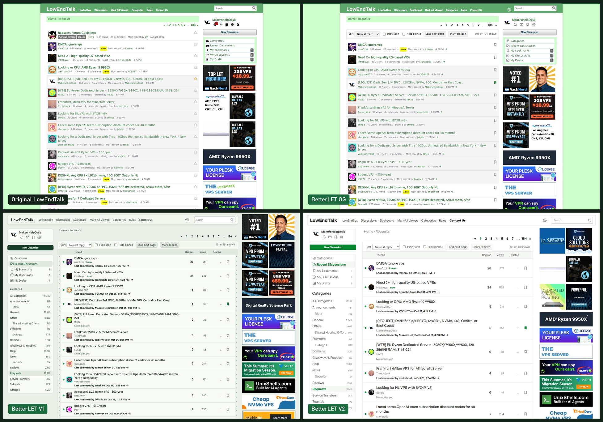
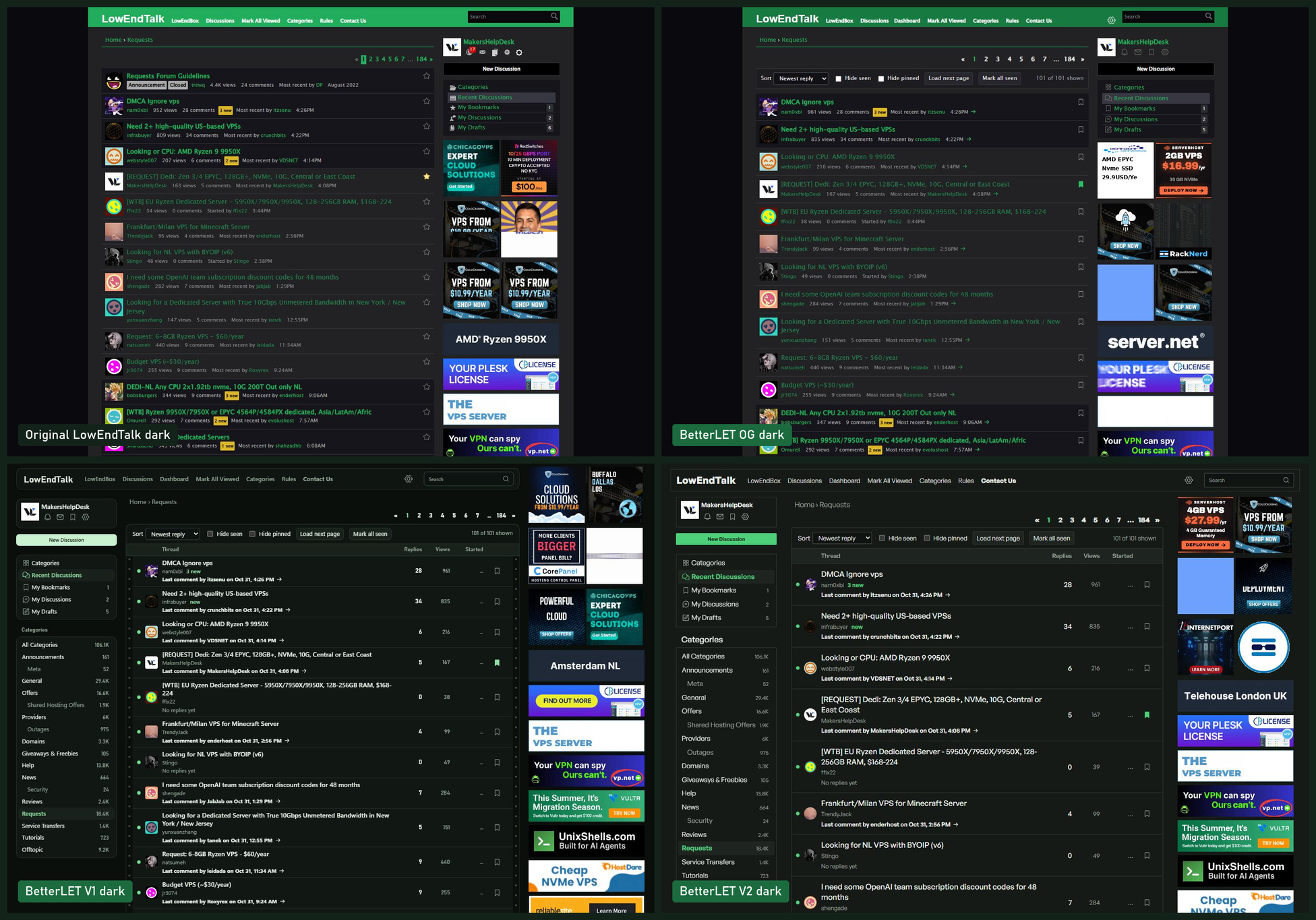
First thing everyone will ask: no, it does not block ads. Ads keep LET and LEB online. It never hides, shrinks, or covers one.
What it does
Thread list:
- Status lights show what you haven't opened, or what has new replies
- Rows show the title, category, author, and last comment with date and time
- The title opens the first post. The date and arrow jump to the last comment
- Sort by newest reply, newest thread, oldest thread, or most replies
- Hide seen threads and pinned threads. Your own threads always stay
Threads:
- Signatures and long "Thanked by" lists stay closed until you click them
- Ctrl+Enter sends your comment
Everything else:
- Wider layout with a left sidebar that stays put
- Auto, Light, and Dark themes
- Hover a username to see their roles, join date, and activity
- Rebuilt Categories, Profile, Settings, and posting pages
- Works on older laptops and small screens
There are two designs you can flip between. V1 is a server rack look. V2 matches LowEndBox. I'm curious which one people prefer.
Privacy: No extra browser permissions. Your settings stay in your browser. V2 loads its font from Fontshare.
It's MIT licensed, and it works in Chromium browsers.
Repo and install steps: https://github.com/gfsaaser24/BetterLET
Mods, if this is a problem or belongs in another category, feel free to move it.
Let me know what breaks and what you'd change. If you find odd stuff that breaks, feel free to post with a screenshot.
Yes, AI made it.
_PS - If you have feedback to offer, I would appreciate not being trolled. Provide some helpful feedback if possible. _



Comments
Ewwwww
Oh my god, no thank you. I do not want a slop UI
Yeah, it would be slop UI if I hadn't taken the time to actually do a decent job with it. IMO at least. Thanks for the great feedback.
Buddy, it has the iconic slop style.
What do you define as "slop" because its color matched, it uses newer icons, its class matched and token matched. If you're talking about radius corners and edges - yeah thats newer common UI.
You'll need to educate me about what about the style of it reads as bad.
Fork it and make it better.
Even though it took some time, one thing I've noticed after the AI boom is that everyone seems to be copying the same UI/UX designs everywhere. It's not necessarily bad design, but it feels like creativity has disappeared.
It also looks a lot like NodeSeek. The current LET theme has its own character and personality. Yes, it's old, but it has life. It's distinctive and has its own identity. Most newer designs don't have that. They're clean, but feel hollow, like they're missing a soul.
100K worth slop design ( According to vibe coders community )
What's wrong with the let layout?
Ok this is solid. Appreciate the feedback. Yeah I mean I didn't really give any creative direction other than to modernize and to make it a bit easier to read. I also added a bunch of features that weren't here that I missed from my VBB days.
No, I don't want to fork your slop. The current LET design is way better.
You know, nothing inherently! Its a bit dated, it was missing a few features and I didn't want to take away from its layout or the way it does things either, so I would say 95% of it is still here. I think the added features like, hover on user cards, how you can hide threads youve seen and a few others.
I could even rework it and keep the OG styling and just add the features too and maybe add a little bit of spacing. The dark mode gets closer, the V2 mode matches LEB.
It's easier to make a custom script with tampermonkey. I use to have one that made LET look like JIRA for work, but I got bored eventually.
Thanks for your super duper fantastic feedback. I'll be sure to file it under EXTREMELY USEFUL, right in my trash can.
Just wait until you find out about design languages.. You're surely missing the creativity when every UI even before based on common design style...
@MakersHelpDesk I respect the time you put into this.
Thanks for doing something for the community.
Rewrite it better immediately, make sure no ai is used and you finish today you have 3 hours left, Go! I'll sit and watch how you do it better. At least OP isn't trying to sell something as his own creation, he's not hiding the fact that AI was used.
@MakersHelpDesk What models did you use?
Yeah IDK why I would. I am deff gonna add like, an enhanced OG version that keeps the original flavor, adds a wee bit of spacing and some nice upgrades.
make no mistakes.
Hi Administrator, Veteran @jbiloh,
Yes, it's good, but please don't change the current one.
itzmurv,
representing the community.
Why would I rewrite something I don't want?
The only thing i'd change is right now theres not a lot of contrast between the background and the middle+left bar backgrounds, those should be a bit more lighter imo
Seemingly you enjoy running your mouth shitting on other people's efforts, so I thought i'd find you something to occupy yourself with.
Thank you sir. I'm happy to add anything you guys want! I can even stand up a cloudflare worker template. could be used to add all kinds of cool stuff that runs on top.
Love this. Im going to update the post with the other styles it has too. that only shows the V1 lightmode too.
Honestly, slop projects have already made us tired of seeing the same UI/UX style everywhere. It's getting repetitive.
Yeah, the same flat designs and stock photos everywhere. But there are hidden masterpieces out there.
How about less ram usage ?
This was opus 5.5, loaded with a few design skills I hoard.
>
Even in Helium I can't get this thing to stop DEVOURING ram.
Yeah, I guess so. In my opinion, don't rely too much on design skills. That's one reason everything ends up looking the same. You could use reference websites from award-winning designs on Awwwards, or prototype with your own ideas. You could also tell AI to use the information from those skills as guidance without strictly following them. use Markdown files to document every prompt, decision and piece of information in detail. Organise them with date-based names, including the month and year. It helps a lot when modernising a project. But as I said before, it has lost its soul.
When @jbiloh added the leaderboard, I thought it was over. It looked completely sloppy and generic. Anyways, it got removed. It was a good idea, but I hope it comes back in the same style as the rest of the site. Also, nice to see I was the third person on the leaderboard!
waiting for next olympic summer games new event, slopstyle.
The standard LowEndTalk theme will continue.
Future updates will be strictly focused on retaining the flavor that makes LowEndTalk special.